
Perhaps [those bothered by displays of extravagance] should mind their own business instead of mapping someone else's budget. Maybe we all should. We'd be happier. That isn't the spirit of the moment, unfortunately. Obsessing about inequality is.Excuse me for a minute while I get out my hanky. This is truly heartbreaking news, sadder than anything I've ever read that didn't involve orphan puppies with their big tearful puppy dog eyes. It almost makes me want to start up a telethon, right now, to raise money to help all those poor rich people pay their taxes.
Debate over taxes illustrates this. Resurgent, Democrats say they'll let President Bush's tax cuts expire. Not all of them, though: They'll keep some breaks, they say, that help the meritoriously unrich. It may surprise you that there were any, since the left's unrelenting line has been that the cuts shafted the middle class.
They didn't. The non-partisan Tax Foundation reports that in 2000, people earning more than $200,000 a year, roughly the top 2%, paid 47% of all federal income taxes, including those on dividends and capital gains. In 2004, after the Bush cuts, those making over $200,000 paid 50% of federal income taxes. [. . .]
Nor is this a momentary quirk. In 1980, the top 5% of earners paid 37% of federal income taxes. In 2004, those in the top 5% paid 57% of the nation's income taxes. [. . .] These trends have run almost uninterrupted since then.
What? Not buying it? Of course you're not; the other 95% of us are having a hard time, I imagine, summoning much sympathy for the top 5%--people with annual income in the $150,000+ range.
No, I'm not an economist, and I don't usually even play one on the internet. But I am a skeptical fellow, and I always ask--as I try to teach my students to ask--about the context. What else might be happening as the rich people's share of income taxes has increased over the last quarter-century or so?
One answer, which explains everything quite neatly, is that the wealthy have not only seen their share of taxes increase, but they've seen their share of all income rising as well. From the folks at The Economist earlier this year:
The figures are startling. According to Emmanuel Saez of the University of California, Berkeley, and Thomas Piketty of the Ecole Normale Supérieure in Paris, the share of aggregate income going to the highest-earning 1% of Americans has doubled from 8% in 1980 to over 16% in 2004. That going to the top tenth of 1% has tripled from 2% in 1980 to 7% today. And that going to the top one-hundredth of 1%--the 14,000 taxpayers at the very top of the income ladder--has quadrupled from 0.65% in 1980 to 2.87% in 2004.Okay, now their numbers are for the top 1%, not the top 5%, as McIlheran uses. But in the same timeframe he employs, the data show that those top 1% have seen their share of national income more than double. Using P-Mac's own figures, the top 5%'s share of taxes has risen barely 1.5 times. In other words, their share of income is increasing faster than their share of taxes.
This next one seems to be from a pro-labor group, so take with whatever salt makes you happy:
In 1970 the richest 1% had incomes 100 times that of the average working American; today the richest 1% enjoy an income 560 times that of the average working class taxpayer in the U.S.--about equivalent to the share they enjoyed in 1929 on the eve of the Great Depression.Again, that's about 1%, not 5%. Still, that's the kind of stuff that does little to soften your heart to the complaints of all those rich people paying all those taxes.
Here, at long last, is something concerning the top 5%. Mark Thoma at Economist's view cites the New York Times last week:
Over all, average incomes rose 27 percent in real terms over the quarter-century from 1979 through 2004. But the gains were narrowly concentrated at the top and offset by losses for the bottom 60 percent of Americans, those making less than $38,761 in 2004. [. . .] Only those in the top 5 percent had significant gains. The average income of those on the 95th to 99th rungs of the income ladder rose by 53 percent, almost twice the average rate.Confirmation: These people saw a doubling of their incomes. But it says nothing about their share of overall income.
Let's try one more, this time with graphs:
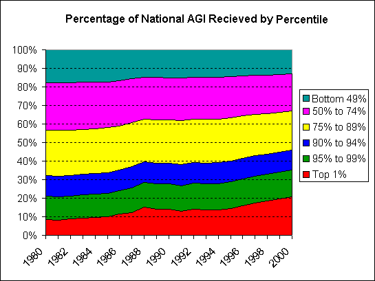
This graph can be a little tricky to read, I have the top income receiver at the bottom and the bottom at the top. I did that so that you can more easily read the percentage of income received by the top receivers. The blue, green, and red series together make up the top 10%, red and green comprise the top 5% and so on. The bottom half of income receivers are represented by the aqua color, and as you can see they receive close to only 10% of the total National Income. The graph shows which segments of the income receivers have been gaining and loosing share. As you can see, the top 50% accounts for more income today than they did in 1980, but that does not mean that every segment of the top 50% has gained a share of income. In fact the only segments to actually have gained in share of national income are members of the top 5%. This can more easily be seen in the summary table below the graph.No, this doesn't get us quite to the present, but the trends are startling: Over 20 years, the share of income earned by the top 5% grew tremendously. The question seems reasonable, then: Is it so surprising that as the wealthiest people earned a greater share of all income they paid a greater share of all taxes? And I think the answer has to be no, it isn't surprising. Nor is it so heartbreaking that McIlheran needs to devote a Wednesday column to it, or that any of the rest of us should feel even the tiniest bit sorry for these people who are making out far better than we.
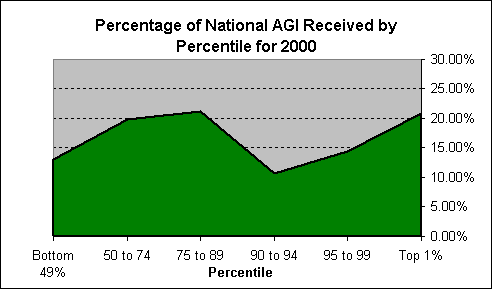
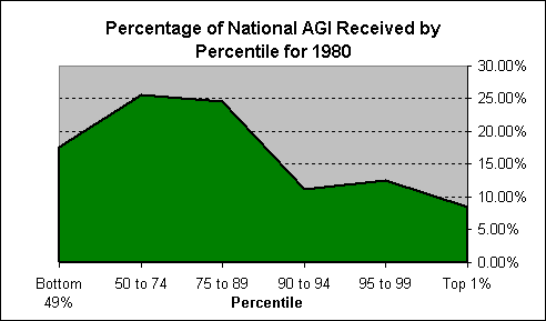
Share of National AGI by Percentile Top 1% 95 to 99 90 to 94 75 to 89 50 to 74 Bottom 49% 1980 8.46% 12.55% 11.12% 24.57% 25.62% 17.68% 2000 20.81% 14.49% 10.71% 21.14% 19.86% 12.99% Share of National AGI by Group Top 1% Top 5% Top 10% Top 25% Top 50% Bottom 49% 1980 8.46% 20.01% 32.13% 56.70% 82.32% 17.68% 2000 20.81% 35.30% 46.01% 67.15% 87.01% 12.99%
The two graphs below represent the data in the Share of National AGI [Adjusted Gross Income] by Percentile table above. Although not completely useful in themselves, as a comparison between 1980 and 2000 the contrast becomes striking.
Of course, the recognition that the distribution of all our national income is so top-heavy--and getting top-heavier--raises all sorts of other questions, but that should wait for another day. In the meantime, just remember this the next time the wealthy come begging for sympathy over how horrible it is to be them and to pay their taxes: They are the ones seeing the big boost from the modern economy; they can afford it. Just dig out that tiny violin and play them a tune as you walk away.
Update: Googling different search terms dug up a different page that has all of these data. You can see the growth in both share of AGI and share of taxes paid in tables 5 and 6 at this page from the Tax Foundation. It's clear that the share of taxes paid by the top 5% has increased at about the same rate as their share of income.
No comments:
Post a Comment